
😎 공부하는 징징알파카는 처음이지?
[Kaggle] Smart Home Dataset with weather Information 본문
[Kaggle] Smart Home Dataset with weather Information
징징알파카 2022. 9. 16. 16:21220916 작성
<본 블로그는kaggle의 koheimuramatus 님의 code와 notebook 을 참고해서 공부하며 작성하였습니다 :-) >
https://www.kaggle.com/code/koheimuramatsu/change-detection-forecasting-in-smart-home/notebook
Change Detection & Forecasting in Smart Home
Explore and run machine learning code with Kaggle Notebooks | Using data from Smart Home Dataset with weather Information
www.kaggle.com
😎 energy data from house appliances and weather information
- 가전제품별 에너지 소비량과 기간 간의 관계를 이해
- 가전제품의 이상 사용을 감지
- 날씨 정보와 태양광 발전 에너지 간의 관계
😎 코드 구현
1️⃣ 라이브러리 로드
- changefinder : 온라인 변경점 감지 라이브러리
- HoloViews : 데이터 분석 및 시각화를 원활하고 간단하게 하도록 설계
- shap : 모든 기계 학습 모델의 출력을 설명하기 위한 게임 이론적인 접근 방식
!pip install changefinder
!conda install -c pyviz holoviews bokeh -y
!pip install lightgbm
!conda install -c conda-forge shap -y
import numpy as np
import pandas as pd
import holoviews as hv
from holoviews import opts
hv.extension('bokeh')
from matplotlib import pyplot as plt
import seaborn as sns
import os
import changefinder
from scipy import stats
from statsmodels.tsa.api import VAR
from statsmodels.tsa.stattools import grangercausalitytests
from statsmodels.tsa.stattools import adfuller
from fbprophet import Prophet
from sklearn.metrics import mean_absolute_error
import shap
shap.initjs()
import lightgbm as lgb
from sklearn.preprocessing import LabelEncoder
from tabulate import tabulate
from IPython.display import HTML, display

2️⃣ 데이터 로드
df = pd.read_csv("HomeC.csv/HomeC.csv",low_memory=False)

print(f'HomeC.csv : {df.shape}')
df.head(3)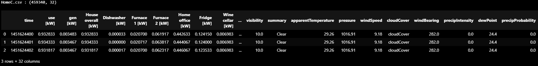
- Weather information
- temperature
- 더위와 추위를 나타내는 물리량
- 더위와 추위를 나타내는 물리량
- humidity
- 공기 중에 존재하는 수증기의 농도
- visibility
- 광선이 이동하는 대기의 길이로 정의되는 기상 광학 범위
- apparentTemperature
- 기온, 상대습도 및 풍속의 복합적인 영향으로 인해 인간이 지각하는 온도 등가
- pressure
- 기압의 하락은 나쁜 날씨가 오고 있음을 나타내고, 기압의 상승은 좋은 날씨를 나타낸다.
- windSpeed
- 일반적으로 온도 변화로 인해 공기가 고압에서 저압으로 이동함에 따라 발생하는 기본적인 대기량
- cloudCover
- 특정 위치에서 관측할 때 구름에 가려진 하늘의 일부
- windBearing
- 기상학에서 방위각 000°는 바람이 불지 않을 때에만 사용되는 반면 360°는 바람이 북쪽에서 불어오는 것을 의미
- 트루 노스(True North)에 관련된 모든 방향은 "트루 베어링(True Bearing)"
- dewPoint
- 물방울이 응축되기 시작하고 이슬이 형성될 수 있는 대기 온도(압력과 습도에 따라 측정)
- precipProbability
- 지정된 예측 기간 및 위치 내에서 최소 강수량이 발생할 확률의 측정
- precipIntensity
- 시간이 지남에 따라 내리는 비의 양을 측정하는 것
- temperature
3️⃣ 전처리
df.columns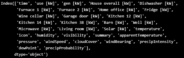
df.columns = [i.replace(' [kW]', '') for i in df.columns]- 더하거나 필요없는 애들 drop
df['Furnace'] = df[['Furnace 1','Furnace 2']].sum(axis=1)
df['Kitchen'] = df[['Kitchen 12','Kitchen 14','Kitchen 38']].sum(axis=1)
df.drop(['Furnace 1','Furnace 2','Kitchen 12','Kitchen 14','Kitchen 38','icon','summary'], axis=1, inplace=True)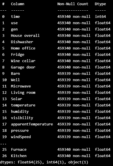
- nan 값 drop
df[df.isnull().any(axis=1)]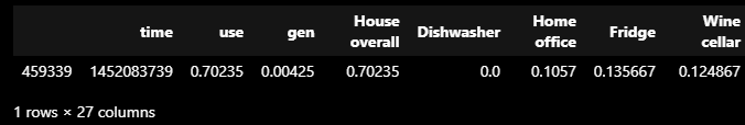
df = df[0:-1]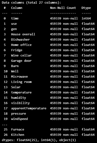
- 잘못된 값들이 누적되어 있음
df['cloudCover'].unique()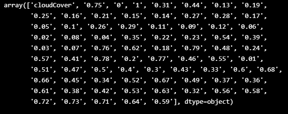
df[df['cloudCover']=='cloudCover'].shape
df['cloudCover'].replace(['cloudCover'], method='bfill', inplace=True)
df['cloudCover'] = df['cloudCover'].astype('float')
4️⃣ datetime information
- 1분의 시간 간격으로 데이터가 수집되었지만 시간 단계가 초 단위로 증가
pd.to_datetime(df['time'], unit='s').head(3)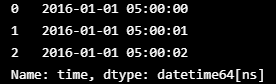
- 몇 분 단위로 새로운 날짜 범위를 만든다
df['time'] = pd.DatetimeIndex(pd.date_range('2016-01-01 05:00', periods=len(df),  freq='min'))
df.head(3)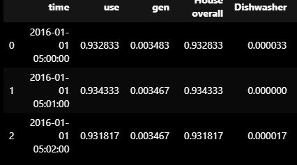
- EDA 및 모델링 단계에서 년, 월, 일 등의 날짜 시간 정보를 활용하려면 시간 열에서 추출
df['year'] = df['time'].apply(lambda x : x.year)
df['month'] = df['time'].apply(lambda x : x.month)
df['day'] = df['time'].apply(lambda x : x.day)
df['weekday'] = df['time'].apply(lambda x : x.day_name())
df['weekofyear'] = df['time'].apply(lambda x : x.weekofyear)
df['hour'] = df['time'].apply(lambda x : x.hour)
df['minute'] = df['time'].apply(lambda x : x.minute)
df.head(3)
5️⃣ Timing information
- Night : 22:00 - 23:59 / 00:00 - 03:59
- Morning : 04:00 - 11:59
- Afternoon : 12:00 - 16:59
- Evening : 17:00 - 21:59
def hours2timing(x):
    if x in [22,23,0,1,2,3]:
        timing = 'Night'
    elif x in range(4, 12):
        timing = 'Morning'
    elif x in range(12, 17):
        timing = 'Afternoon'
    elif x in range(17, 22):
        timing = 'Evening'
    else:
        timing = 'X'
    return timing
df['timing'] = df['hour'].apply(hours2timing)
df.head(3)
6️⃣ Removing Duplicate Columns
fig = plt.subplots(figsize=(10, 8))
corr = df.corr()
sns.heatmap(corr[corr>0.9], vmax=1, vmin=-1, center=0)
plt.show()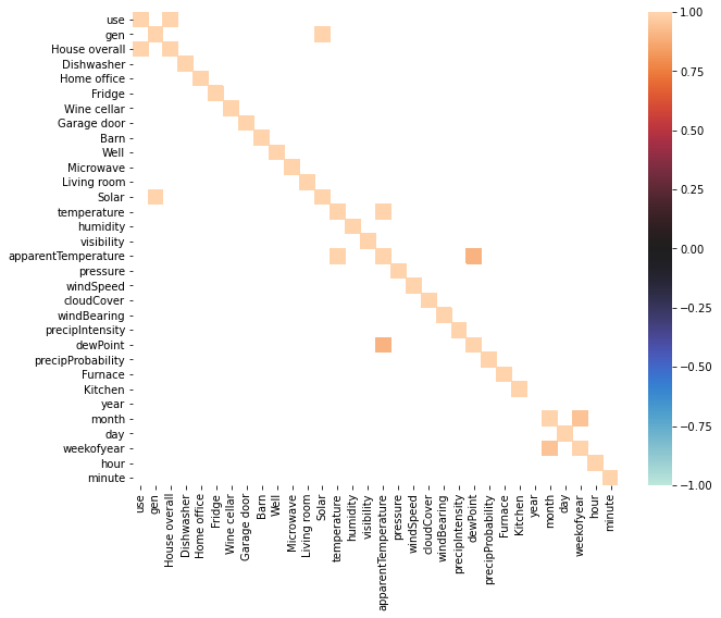
- 'use' - 'house allother'와 'gen'과 'solar' columns' 상관계수가 거의 0.95를 넘었기 때문에 이 컬럼들을 새로운 컬럼으로 합칠 필요가 있음
df['use_HO'] = df['use']
df['gen_Sol'] = df['gen']
df.drop(['use','House overall','gen','Solar'], axis=1, inplace=True)
df.head(3)
7️⃣ EDA
- House Appliances
use = hv.Distribution(df['use_HO']).opts(title="Total Energy Consumption Distribution", color="red")
gen = hv.Distribution(df['gen_Sol']).opts(title="Total Energy Generation Distribution", color="blue")
(use + gen).opts(opts.Distribution(xlabel="Energy Consumption", ylabel="Density", xformatter='%.1fkw', width=400, height=300,tools=['hover'],show_grid=True))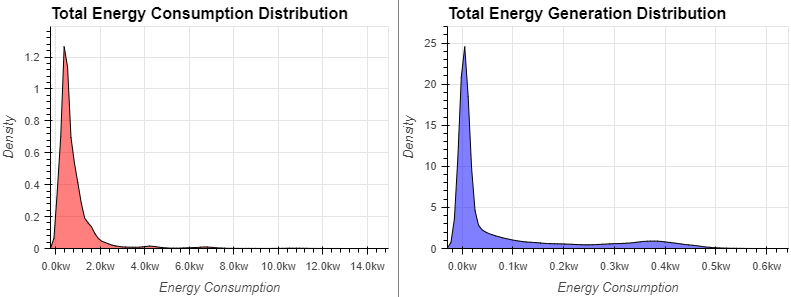
dw = hv.Distribution(df[df['Dishwasher']<1.5]['Dishwasher'],label="Dishwasher").opts(color="red")
ho = hv.Distribution(df[df['Home office']<1.5]['Home office'],label="Home office").opts(color="blue")
fr = hv.Distribution(df[df['Fridge']<1.5]['Fridge'],label="Fridge Distribution").opts(color="orange")
wc = hv.Distribution(df[df['Wine cellar']<1.5]['Wine cellar'],label="Wine cellar").opts(color="green")
gd = hv.Distribution(df[df['Garage door']<1.5]['Garage door'],label="Garage door").opts(color="purple")
ba = hv.Distribution(df[df['Barn']<1.5]['Barn'],label="Barn").opts(color="grey")
we = hv.Distribution(df[df['Well']<1.5]['Well'],label="Well").opts(color="pink")
mcr = hv.Distribution(df[df['Microwave']<1.5]['Microwave'],label="Microwave").opts(color="yellow")
lr = hv.Distribution(df[df['Living room']<1.5]['Living room'],label="Living room").opts(color="brown")
fu = hv.Distribution(df[df['Furnace']<1.5]['Furnace'],label="Furnace").opts(color="skyblue")
ki = hv.Distribution(df[df['Kitchen']<1.5]['Kitchen'],label="Kitchen").opts(color="lightgreen")

(dw * ho * fr * wc * gd * ba * we * mcr * lr * fu * ki).opts(opts.Distribution(xlabel="Energy Consumption", ylabel="Density", xformatter='%.1fkw',title='Energy Consumption of Appliances Distribution',
                    width=800, height=350,tools=['hover'],show_grid=True))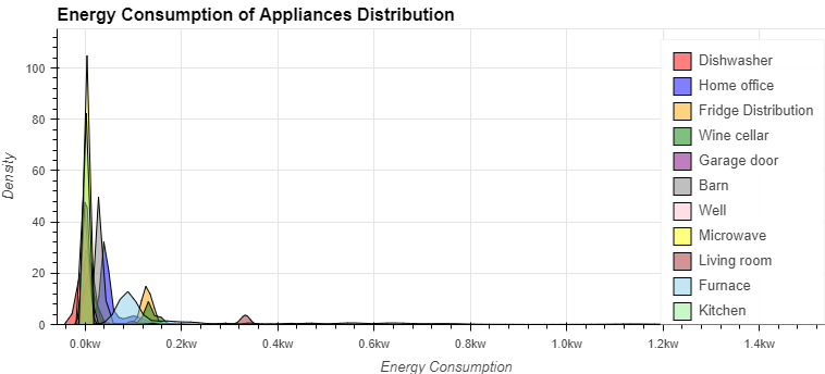
- Weather Information
temp = hv.Distribution(df['temperature'],label="temperature").opts(color="red")
apTemp = hv.Distribution(df['apparentTemperature'],label="apparentTemperature").opts(color="orange")
temps = (temp * apTemp).opts(opts.Distribution(title='Temperature Distribution')).opts(legend_position='top',legend_cols=2)
hmd = hv.Distribution(df['humidity']).opts(color="yellow", title='Humidity Distribution')
vis = hv.Distribution(df['visibility']).opts(color="blue", title='Visibility Distribution')
prs = hv.Distribution(df['pressure']).opts(color="green", title='Pressure Distribution')
wnd = hv.Distribution(df['windSpeed']).opts(color="purple", title='WindSpeed Distribution')
cld = hv.Distribution(df['cloudCover']).opts(color="grey", title='CloudCover Distribution')
prc = hv.Distribution(df['precipIntensity']).opts(color="skyblue", title='PrecipIntensity Distribution')
dew = hv.Distribution(df['dewPoint']).opts(color="lightgreen", title='DewPoint Distribution')

(temps + hmd + vis + prs + wnd + cld + prc + dew).opts(opts.Distribution(xlabel="Values", ylabel="Density", width=400, height=300,tools=['hover'],show_grid=True)).cols(4)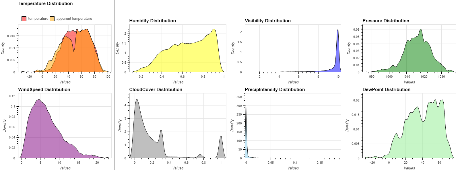
8️⃣ Time Series Analysis
- 에너지 소비는 7월부터 9월까지 최고조에 달함
- 에너지 세대는 큰 정점이 없지만 1월부터 7월까지 점차 상승하다가 서서히 하락
def groupByMonth(col):
    return df[[col,'month']].groupby('month').agg({col:['mean']})[col]
def groupByWeekday(col):
weekdayDf = df.groupby('weekday').agg({col:['mean']})
weekdayDf.columns = [f"{i[0]}_{i[1]}" for i in weekdayDf.columns]
weekdayDf['week_num'] = [['Monday', 'Tuesday', 'Wednesday', 'Thursday', 'Friday', 'Saturday', 'Sunday'].index(i) for i in weekdayDf.index]
weekdayDf.sort_values('week_num', inplace=True)
weekdayDf.drop('week_num', axis=1, inplace=True)
return weekdayDfdef groupByTiming(col):
timingDf = df.groupby('timing').agg({col:['mean']})
timingDf.columns = [f"{i[0]}_{i[1]}" for i in timingDf.columns]
timingDf['timing_num'] = [['Morning','Afternoon','Evening','Night'].index(i) for i in timingDf.index]
timingDf.sort_values('timing_num', inplace=True)
timingDf.drop('timing_num', axis=1, inplace=True)
return timingDfdf = df.set_index(df['time'])
use = hv.Curve(df['use_HO'].resample('D').mean()).opts(title="Total Energy Consumption Time-Series by Day", color="red", ylabel="Energy Consumption")
gen = hv.Curve(df['gen_Sol'].resample('D').mean()).opts(title="Total Energy Generation Time-Series by Day", color="blue", ylabel="Energy Generation")
(use + gen).opts(opts.Curve(xlabel="Day", yformatter='%.1fkw', width=400, height=300,tools=['hover'],show_grid=True,fontsize={'title':11}))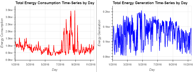
use = hv.Curve(groupByMonth('use_HO')).opts(title="Total Energy Consumption Time-Series by Month", color="red", ylabel="Energy Consumption")
gen = hv.Curve(groupByMonth('gen_Sol')).opts(title="Total Energy Generation Time-Series by Month", color="blue", ylabel="Energy Generation")
(use + gen).opts(opts.Curve(xlabel="Month", yformatter='%.1fkw', width=400, height=300,tools=['hover'],show_grid=True,fontsize={'title':10})).opts(shared_axes=False)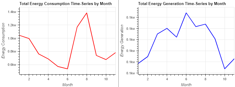
- 직관적으로 에너지 소비와 발전의 주간 추세는 없다
- 현실적으로 약간의 추세가 있는 것처럼 보이지만, 가치의 변화는 무시 가능
use = hv.Curve(groupByWeekday('use_HO')).opts(title="Total Energy Consumption Time-Series by Weekday", color="red", ylabel="Energy Consumption")
gen = hv.Curve(groupByWeekday('gen_Sol')).opts(title="Total Energy Generation Time-Series by Weekday", color="blue", ylabel="Energy Generation")
(use + gen).opts(opts.Curve(xlabel="Weekday", yformatter='%.2fkw', width=400, height=300,tools=['hover'],show_grid=True, xrotation=20,fontsize={'title':10})).opts(shared_axes=False)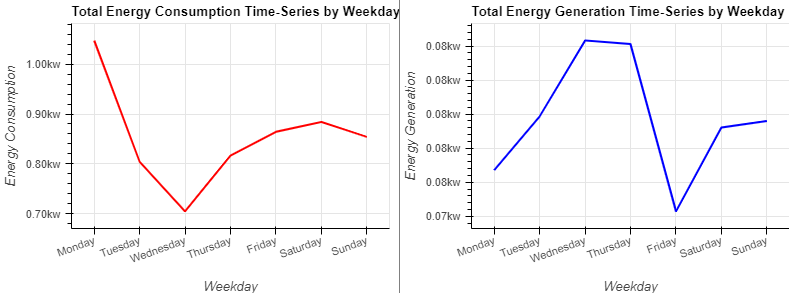
- 에너지 소비는 낮에는 낮고 밤에는 높음
- 에너지 생성은 낮에는 높고 밤에는 낮음
- 낮에는 집에 주민이 없기 때문에 에너지 발전이 촉진
- 밤에는 주민이 귀가하기 때문에 소비가 증가
use = hv.Curve(groupByTiming('use_HO')).opts(title="Total Energy Consumption Time-Series by Timing", color="red", ylabel="Energy Consumption")
gen = hv.Curve(groupByTiming('gen_Sol')).opts(title="Total Energy Generation Time-Series by Timing", color="blue", ylabel="Energy Generation")
(use + gen).opts(opts.Curve(xlabel="Timing", yformatter='%.1fkw', width=400, height=300,tools=['hover'],show_grid=True,fontsize={'title':10})).opts(shared_axes=False)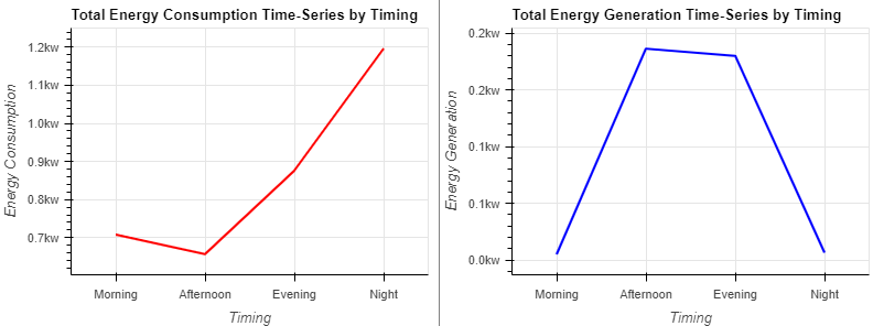
- 홈 오피스, 냉장고, 와인 셀러, 거실 및 가구에는 분명히 시계열 트렌드 존재
- 가전제품은 계절에 따라 실내 온도를 일정하게 유지하거나 편안한 온도로 조절해야 되기 때문
dw = hv.Curve(df['Dishwasher'].resample('D').mean(),label="Dishwasher Time-Series by Day").opts(color="red")
ho = hv.Curve(df['Home office'].resample('D').mean(),label="Home office Time-Series by Day").opts(color="blue")
fr = hv.Curve(df['Fridge'].resample('D').mean(),label="Fridge Time-Series by Day").opts(color="orange")
wc = hv.Curve(df['Wine cellar'].resample('D').mean(),label="Wine cellar Time-Series by Day").opts(color="green")
gd = hv.Curve(df['Garage door'].resample('D').mean(),label="Garage door Time-Series by Day").opts(color="purple")
ba = hv.Curve(df['Barn'].resample('D').mean(),label="Barn Time-Series by Day").opts(color="grey")
we = hv.Curve(df['Well'].resample('D').mean(),label="Well Time-Series by Day").opts(color="pink")
mcr = hv.Curve(df['Microwave'].resample('D').mean(),label="Microwave Time-Series by Day").opts(color="yellow")
lr = hv.Curve(df['Living room'].resample('D').mean(),label="Living room Time-Series by Day").opts(color="brown")
fu = hv.Curve(df['Furnace'].resample('D').mean(),label="Furnace Time-Series by Day").opts(color="skyblue")
ki = hv.Curve(df['Kitchen'].resample('D').mean(),label="Kitchen Time-Series by Day").opts(color="lightgreen")

(dw + ho + fr + wc + gd + ba + we + mcr + lr + fu + ki).opts(opts.Curve(xlabel="Day", ylabel="Energy Consumption", yformatter='%.2fkw' , \
                                                                               width=400, height=300,tools=['hover'],show_grid=True)).cols(6)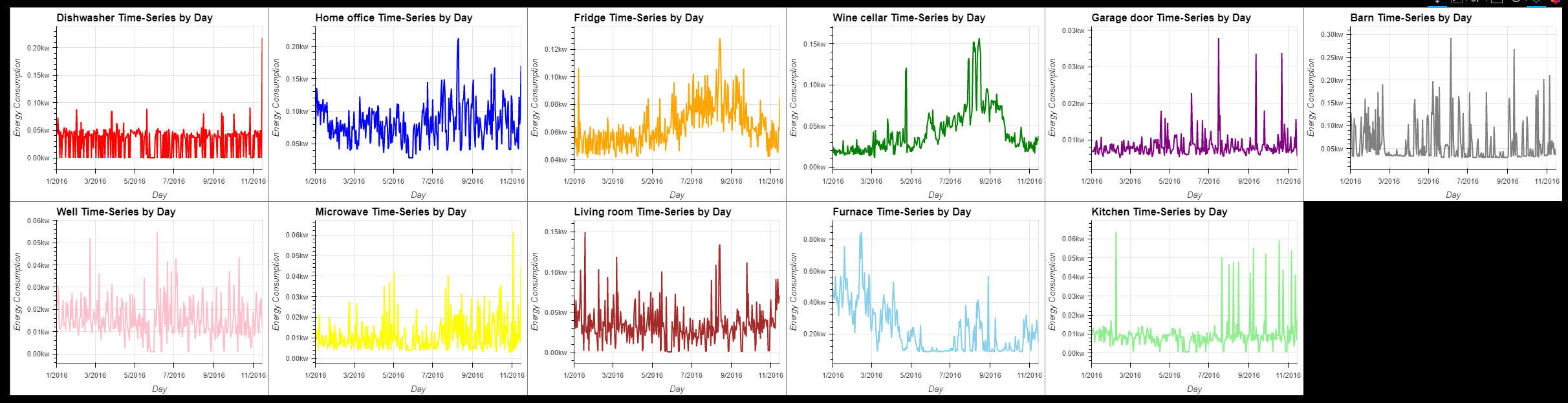
- 달마다의 가전제품의 에너지 소비량
dw = hv.Curve(groupByMonth('Dishwasher'),label="Dishwasher Time-Series by Month").opts(color="red")
ho = hv.Curve(groupByMonth('Home office'),label="Home office Time-Series by Month").opts(color="blue")
fr = hv.Curve(groupByMonth('Fridge'),label="Fridge Time-Series by Month").opts(color="orange")
wc = hv.Curve(groupByMonth('Wine cellar'),label="Wine cellar Time-Series by Month").opts(color="green")
gd = hv.Curve(groupByMonth('Garage door'),label="Garage door Time-Series by Month").opts(color="purple")
ba = hv.Curve(groupByMonth('Barn'),label="Barn Time-Series by Month").opts(color="grey")
we = hv.Curve(groupByMonth('Well'),label="Well Time-Series by Month").opts(color="pink")
mcr = hv.Curve(groupByMonth('Microwave'),label="Microwave Time-Series by Month").opts(color="yellow")
lr = hv.Curve(groupByMonth('Living room'),label="Living room Time-Series by Month").opts(color="brown")
fu = hv.Curve(groupByMonth('Furnace'),label="Furnace Time-Series by Month").opts(color="skyblue")
ki = hv.Curve(groupByMonth('Kitchen'),label="Kitchen Time-Series by Month").opts(color="lightgreen")

(dw + ho + fr + wc + gd + ba + we + mcr + lr + fu + ki).opts(opts.Curve(xlabel="Month", ylabel="Energy Consumption", yformatter='%.2fkw', \
                                                                               width=400, height=300,tools=['hover'],show_grid=True)).opts(shared_axes=False).cols(6)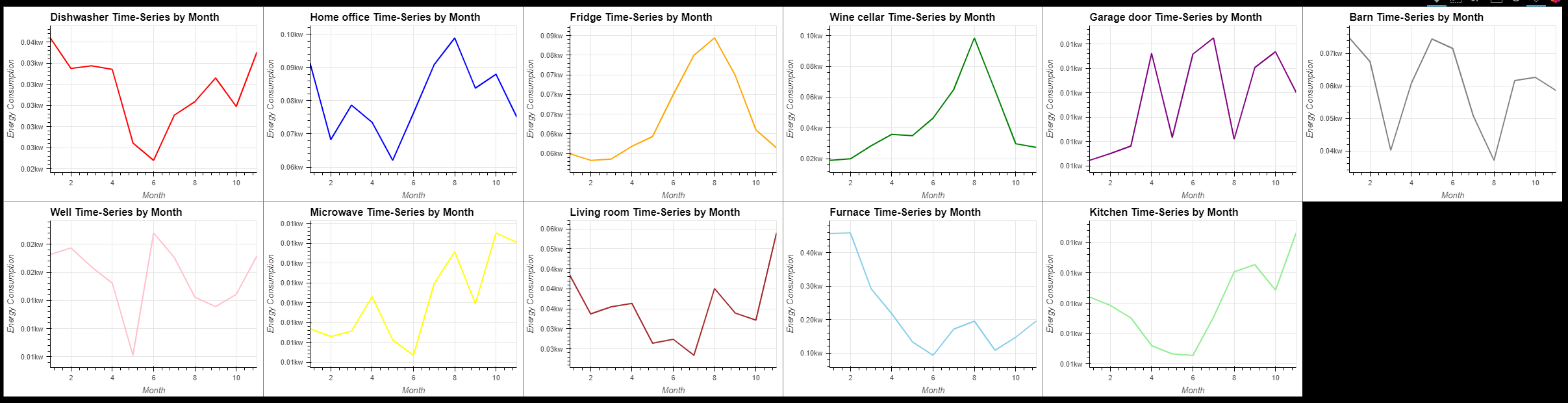
- 가전제품의 에너지 소비량에는 주간 추세가 없다.
dw = hv.Curve(groupByWeekday('Dishwasher'),label="Dishwasher Time-Series by Weekday").opts(color="red")
ho = hv.Curve(groupByWeekday('Home office'),label="Home office Time-Series by Weekday").opts(color="blue")
fr = hv.Curve(groupByWeekday('Fridge'),label="FridgeTime-Series by Weekday").opts(color="orange")
wc = hv.Curve(groupByWeekday('Wine cellar'),label="Wine cellar Time-Series by Weekday").opts(color="green")
gd = hv.Curve(groupByWeekday('Garage door'),label="Garage door Time-Series by Weekday").opts(color="purple")
ba = hv.Curve(groupByWeekday('Barn'),label="Barn Time-Series by Weekday").opts(color="grey")
we = hv.Curve(groupByWeekday('Well'),label="Well Time-Series by Weekday").opts(color="pink")
mcr = hv.Curve(groupByWeekday('Microwave'),label="Microwave Time-Series by Weekday").opts(color="yellow")
lr = hv.Curve(groupByWeekday('Living room'),label="Living room Time-Series by Weekday").opts(color="brown")
fu = hv.Curve(groupByWeekday('Furnace'),label="Furnace Time-Series by Weekday").opts(color="skyblue")
ki = hv.Curve(groupByWeekday('Kitchen'),label="Kitchen Time-Series by Weekday").opts(color="lightgreen")

(dw + ho + fr + wc + gd + ba + we + mcr + lr + fu + ki).opts(opts.Curve(xlabel="Weekday", ylabel="Energy Consumption", yformatter='%.2fkw', \
                                                                               width=400, height=300,tools=['hover'],show_grid=True, xrotation=20)).opts(shared_axes=False).cols(6)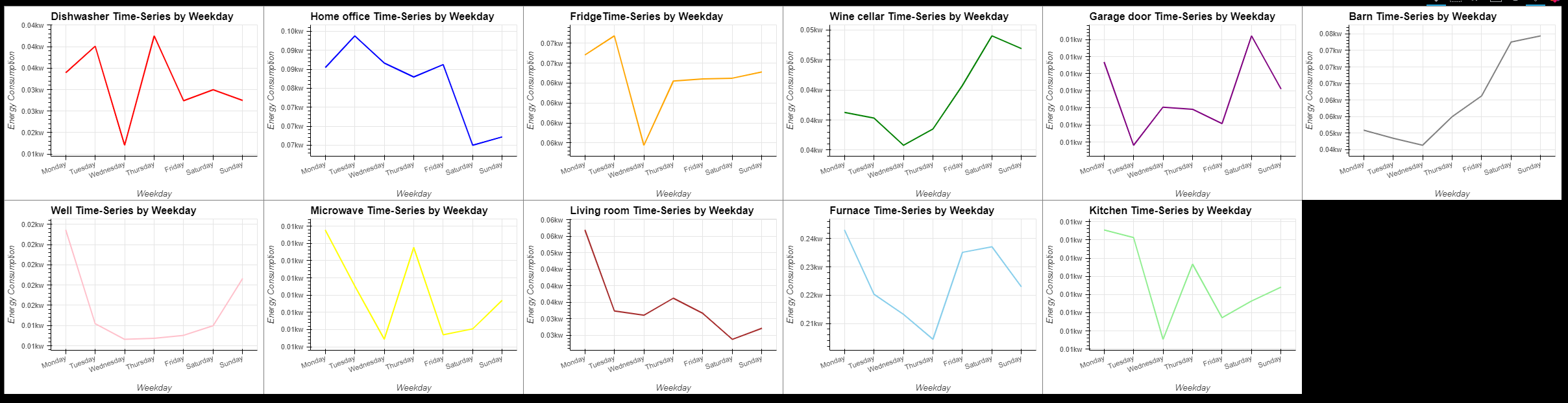
- 전체적으로 저녁부터 밤사이 에너지 소비량이 소폭 증가
- 주민들이 직장에서 돌아와 생산적인 활동을 시작하기 때문
dw = hv.Curve(groupByTiming('Dishwasher'),label="Dishwasher Time-Series by Timing").opts(color="red")
ho = hv.Curve(groupByTiming('Home office'),label="Home office Time-Series by Timing").opts(color="blue")
fr = hv.Curve(groupByTiming('Fridge'),label="FridgeTime-Series by Timing").opts(color="orange")
wc = hv.Curve(groupByTiming('Wine cellar'),label="Wine cellar Time-Series by Timing").opts(color="green")
gd = hv.Curve(groupByTiming('Garage door'),label="Garage door Time-Series by Timing").opts(color="purple")
ba = hv.Curve(groupByTiming('Barn'),label="Barn Time-Series by Timing").opts(color="grey")
we = hv.Curve(groupByTiming('Well'),label="Well Time-Series by Timing").opts(color="pink")
mcr = hv.Curve(groupByTiming('Microwave'),label="Microwave Time-Series by Timing").opts(color="yellow")
lr = hv.Curve(groupByTiming('Living room'),label="Living room Time-Series by Timing").opts(color="brown")
fu = hv.Curve(groupByTiming('Furnace'),label="Furnace Time-Series by Timing").opts(color="skyblue")
ki = hv.Curve(groupByTiming('Kitchen'),label="Kitchen Time-Series by Timing").opts(color="lightgreen")

(dw + ho + fr + wc + gd + ba + we + mcr + lr + fu + ki).opts(opts.Curve(xlabel="Timing", ylabel="Energy Consumption", yformatter='%.2fkw', \
                                                                               width=400, height=300,tools=['hover'],show_grid=True)).opts(shared_axes=False).cols(6)
9️⃣ Weather Time-Series
temp = hv.Curve(df['temperature'].resample('D').mean(),label="temperature").opts(color="red")
apTemp = hv.Curve(df['apparentTemperature'].resample('D').mean(),label="apparentTemperature").opts(color="orange")
temps = (temp * apTemp).opts(opts.Curve(title='Temperature Time-Series by Day')).opts(legend_position='top',legend_cols=2)
hmd = hv.Curve(df['humidity'].resample('D').mean()).opts(color="yellow", title='Humidity Time-Series by Day')
vis = hv.Curve(df['visibility'].resample('D').mean()).opts(color="blue", title='Visibility Time-Series by Day')
prs = hv.Curve(df['pressure'].resample('D').mean()).opts(color="green", title='Pressure Time-Series by Day')
wnd = hv.Curve(df['windSpeed'].resample('D').mean()).opts(color="purple", title='WindSpeed Time-Series by Day')
cld = hv.Curve(df['cloudCover'].resample('D').mean()).opts(color="grey", title='CloudCover Time-Series by Day')
prc = hv.Curve(df['precipIntensity'].resample('D').mean()).opts(color="skyblue", title='PrecipIntensity Time-Series by Day')
dew = hv.Curve(df['dewPoint'].resample('D').mean()).opts(color="lightgreen", title='DewPoint Time-Series by Day')

(temps + hmd + vis + prs + wnd + cld + prc + dew).opts(opts.Curve(xlabel="Day", ylabel="Values", width=400, height=300,tools=['hover'],show_grid=True)).cols(4)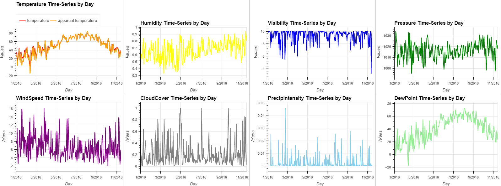
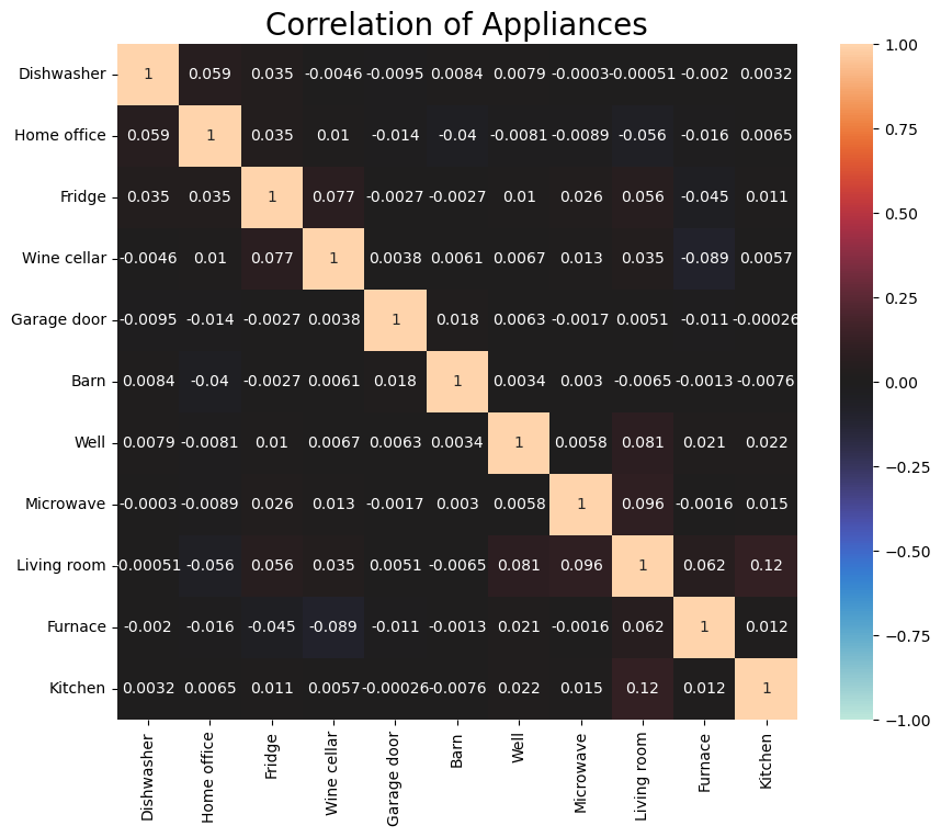
🔟 Correlation Analysis
- 가전끼리는 아무 관계 없다
fig,ax = plt.subplots(figsize=(10, 8))
corr = df[['Dishwasher','Home office','Fridge','Wine cellar','Garage door','Barn','Well','Microwave','Living room','Furnace','Kitchen']].corr()
sns.heatmap(corr, annot=True, vmin=-1.0, vmax=1.0, center=0)
ax.set_title('Correlation of Appliances',size=20)
plt.show()
- 날씨와의 상관관계
- 온도는 겉보기 온도 및 이슬점과 관련
- 습도는 가시성, 풍속, 구름 덮개 및 이슬점과 관련
- 가시성은 습도, 풍속, 구름 덮개 및 강수량과 관련
- CloudCover는 습도, 가시성 및 강수량과 관련
- 강수 강도는 가시성 및 구름 덮개와 관련
- DewPoint는 온도, 명백한 온도 및 습도와 관련
fig,ax = plt.subplots(figsize=(10, 8))
corr = df[['temperature','apparentTemperature','humidity','visibility','pressure','windSpeed','cloudCover','precipIntensity','dewPoint']].corr()
sns.heatmap(corr, annot=True, vmin=-1.0, vmax=1.0, center=0)
ax.set_title('Correlation of Weather Information',size=20)
plt.show()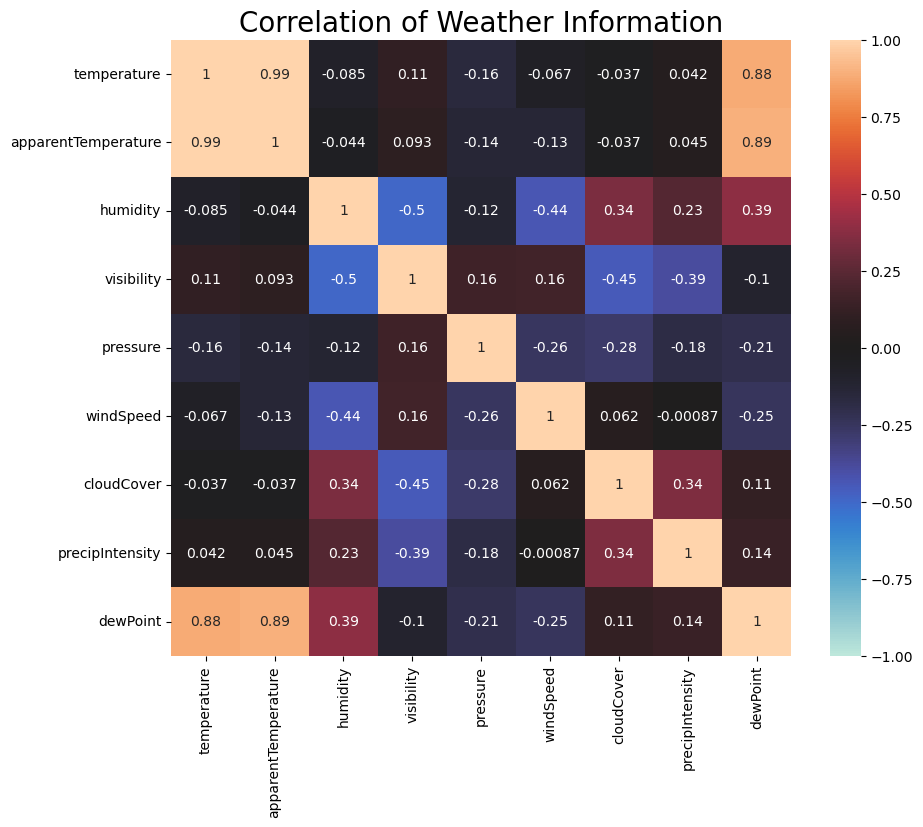
- 일부 가전제품은 날씨 정보의 영향 받음
- 냉장고는 온도, 외관상 온도 및 이슬점과 관련
- 와인 저장고는 온도, 외관상 온도 및 이슬점과 관련
- 용해로는 온도, 외관상 온도, 풍속 및 이슬점과 관련
fig,ax = plt.subplots(figsize=(20, 12))
corr = df[['use_HO','gen_Sol','Dishwasher','Home office','Fridge','Wine cellar','Garage door','Barn','Well','Microwave','Living room','Furnace','Kitchen',\
           'temperature','apparentTemperature','humidity','visibility','pressure','windSpeed','cloudCover','precipIntensity','dewPoint']].corr()
sns.heatmap(corr, annot=True, vmin=-1.0, vmax=1.0, center=0)
ax.set_title('Correlation of Appliances & Weather Information',size=20)
plt.show()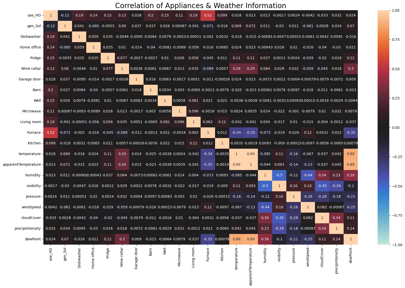
1️⃣1️⃣ Model
🟣 변경 감지 : 과도한 에너지 소비량을 사전에 감지하여 사용료 인상을 방지
🟣 미래소비 예측 : 기상정보 활용 및 에너지 공급 최적화로 미래 에너지 소비 및 발전 예측
▶ 🟣 Case1. Detect Changes in Energy Consumption
- 에너지 소비량 데이터에서 에너지 소비량 사용 경향의 변화점을 포착할 수 있을 것
- 소비 트렌드의 변화를 포착함으로써 소비가 증가할 가능성이 있는 달에 에너지 공급을 늘리고
- 감소할 가능성이 있는 달에 에너지 공급을 줄이는 방법을 생각
- change point
- 변경 지점은 시계열 데이터의 추세가 시간에 따라 변화하는 지점
- 특이치는 순간적인 이상 상태(급격한 감소 또는 증가)를 나타냄
- 변화점은 이상 상태가 원래 상태로 돌아가지 않고 계속된다
- ChangeFinder
- 변경 지점을 감지하는 데 사용되는 알고리즘
- SDAR(Sequency Discounting AR) 알고리즘에 기반한 로그 우도를 사용하여 변경 점수를 계산
- SDAR 알고리듬은 AR 알고리즘에 할인 매개 변수를 도입하여 과거 데이터의 영향을 줄임으로써 정지하지 않은 시계열 데이터도 강력하게 학습
- Training STEP1
- SDAR 알고리즘을 사용하여 각 데이터 지점에서 시계열 모델 교육
- 훈련된 시계열 모형을 기반으로 다음 시점의 데이터 점이 나타날 가능성을 계산
- 로그 손실을 계산하여 특이치 점수로 사용
- Score(xt)=−logPt−1(xt|x1,x2,…,xt−1)
- Smoothing Step
- smoothing window(WW) 내에서 특이치 점수를 평활
- 평활화를 통해 특이치로 인한 점수가 감쇠되며, 이상 상태가 오랫동안 지속되었는지 여부를 확인
- Score_smoothed(xt)=1W∑t=t−W+1tScore(xi)
- Training STEP2
- Smoothing 을 통해 얻은 점수를 사용하여 SDAR 알고리즘으로 모델을 교육
- 훈련된 시계열 모형을 기반으로 다음 시점의 데이터 점이 나타날 가능성을 계산
- 로그 손실을 계산하여 변경 점수로 사용
- Training STEP1
- Hyperparameter Tuning
- Discounting parameter r(0<r<1)r(0<r<1) : 이 값이 작을수록 과거 데이터 포인트의 영향력은 커지며 변경점수의 변동은 커짐
- Order parameter for AR orderorder : 과거 데이터 포인트가 모형에 얼마나 포함되어 있는지 여부
- Smoothing window smoothsmooth : 파라미터가 클수록 특이치보다 본질적인 변화를 포착하기 쉽지만 너무 클 경우 변경 내용 자체를 포착하기 어려움
def chng_detection(col, _r=0.01, _order=1, _smooth=10):
    cf = changefinder.ChangeFinder(r=_r, order=_order, smooth=_smooth)
    ch_df = pd.DataFrame()
    ch_df[col] = df[col].resample('D').mean()
    # calculate the change score
    ch_df['change_score'] = [cf.update(i) for i in ch_df[col]]
    ch_score_q1 = stats.scoreatpercentile(ch_df['change_score'], 25)
    ch_score_q3 = stats.scoreatpercentile(ch_df['change_score'], 75)
    thr_upper = ch_score_q3 + (ch_score_q3 - ch_score_q1) * 3

    anom_score = hv.Curve(ch_df['change_score'])
    anom_score_th = hv.HLine(thr_upper).opts(color='red', line_dash="dotdash")

    anom_points = [[ch_df.index[i],ch_df[col][i]] for i, score in enumerate(ch_df["change_score"]) if score > thr_upper]
    org = hv.Curve(ch_df[col],label=col).opts(yformatter='%.1fkw')
    detected = hv.Points(anom_points, label=f"{col} detected").opts(color='red', legend_position='bottom', size=5)

    return ((anom_score * anom_score_th).opts(title=f"{col} Change Score & Threshold") + \
(org * detected).opts(title=f"{col} Detected Points")).opts(opts.Curve(width=800, height=300, show_grid=True, tools=['hover'])).cols(1)- 에너지 소비의 변화점을 탐지할 수 있는 모델을 구축
- 데이터 추세가 변화하는 7월(급증)과 9월(급감)의 변화점을 포착
chng_detection('use_HO', _r=0.001, _order=1, _smooth=3)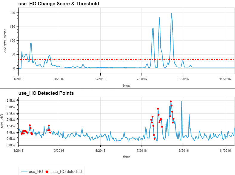
▶ 🟣 Case2. Predict Future Energy Consumption
- 기상 정보로부터 각 기기의 에너지 소비량을 예측하는 것이 가능
- 에너지 소비량을 예측함으로써 날씨 정보를 기반으로 필요한 에너지 공급량을 추정할 수 있어 에너지 최적화가 가능
- VAR, President, LightGBM의 세 가지 모델
✔ 1) MODEL VAR
- 벡터 자기 회귀(VAR) 모델은 자기 회귀(AR) 모델의 다변량 확장
- 여러 변수를 이용한 예측이 가능하며, 단일 변수를 이용한 예측에 비해 예측 정확도가 향상될 것
def grangerTestPlot(weather_info, applicances, _maxlag):
    grangerTest_df = pd.DataFrame()
    for weather in weather_info:
        for appliance in applicances:
            test_result = grangercausalitytests(df[[appliance, weather]], maxlag=_maxlag, verbose=False)
            p_values = [round(test_result[i][0]['ssr_chi2test'][1],4) for i in range(1, _maxlag+1)]
            min_p_value = np.min(p_values)
            grangerTest_df.loc[appliance, weather] = min_p_value

    fig,ax = plt.subplots(figsize=(10, 8))
    sns.heatmap(grangerTest_df, vmax=1, vmin=0, center=1, annot=True)
    ax.set_title('Granger Causality Test Result',size=20)
    plt.xlabel("Weather Information",size=15)
    plt.ylabel("Energy Consumption",size=15)
plt.show()- 가정 전체 및 일반 가전제품의 에너지 소비량을 선정하여 기상정보로 Granger Causality Test 를 실시
- 선택된 두 에너지 소비 변수에서 압력pressure과 가시성visibility의 P-값이 5%를 초과
- 이들 쌍 사이에 인과관계가 관찰되지 않았음
grangerTestPlot(
    weather_info=['temperature', 'humidity', 'visibility', 'pressure', 'windSpeed', 'cloudCover', 'windBearing', 'precipIntensity','dewPoint'], \
    applicances=['use_HO','Wine cellar'], \
    _maxlag=12)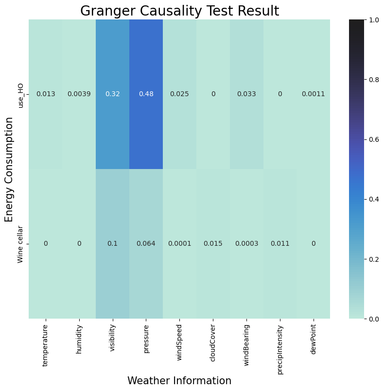
- 많은 시계열 모델링 방법에서는 데이터가 정상이어야 하기 때문에 정상성은 시계열 모델링에 중요
- 데이터의 평균은 일정
- 데이터의 분산이 일정
- 데이터의 공분산은 일정
- 정상성을 테스트하기 위해 Augmented Dickey-Fuller Test 를 사용
- ADF 검사 결과 모든 변수의 P-값은 5% 이내
for i in ['temperature', 'humidity','windSpeed', 'cloudCover', 'windBearing', 'precipIntensity','dewPoint','use_HO','Wine cellar']:
    print(f"p-value {i} : {adfuller(df[i].resample('H').mean(), autolag='AIC', regression = 'ct')[1]}")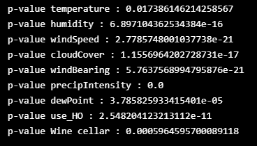
- 설명 변수에 날씨 정보를 추가한 총 에너지 소비량과 와인 셀러 에너지 소비량의 예측 결과
- 둘 다 대체로 아주 짧은 시간 안에 잘 예측
var_df = df.resample('H').mean()
def var_train(cols=['temperature', 'humidity', 'visibility',  'windSpeed', 'windBearing', 'dewPoint','Furnace', 'use_HO'], max_order=10, train_ratio=0.9,test_ratio=0.1):
    #make dataframe for training
    tr,te = [int(len(var_df) * i) for i in [train_ratio, test_ratio]]
    train, test = var_df[0:tr], var_df[tr:]
    #model training
    var_func = VAR(train[cols], freq='H')
    var_func.select_order(max_order)
    model = var_func.fit(maxlags=max_order, ic='aic', trend='ct')
    model_result = model.summary()
    #make predict dataframe
    varForecast_df = pd.DataFrame(model.forecast(model.endog, steps=len(test)),columns=cols)
    varForecast_df.index = test.index

    return varForecast_df, model_result
- 모델 평가
varForecast_df, model_result = var_train(cols=['temperature', 'humidity','windSpeed', 'cloudCover', 'windBearing', 'precipIntensity','dewPoint','use_HO','Wine cellar'], \
                                         max_order=48, train_ratio=0.99,test_ratio=0.01)
#evaluation with MAE
var_use_mae = mean_absolute_error(var_df['use_HO'][-len(varForecast_df):], varForecast_df['use_HO'])
((hv.Curve(var_df['use_HO'], label='use_HO').opts(color='blue')\
  * hv.Curve(varForecast_df['use_HO'], label='use_HO predicted').opts(color='red', title='VAR Result - Total Energy Consumption')).opts(legend_position='bottom') + \
 (hv.Curve(var_df['use_HO'][-int(len(var_df)*0.05):], label='use_HO').opts(color='blue') \
  * hv.Curve(varForecast_df['use_HO'], label='use_HO predicted').opts(color='red', title='VAR Result Enlarged - Total Energy Consumption')).opts(legend_position='bottom'))\
    .opts(opts.Curve(xlabel="Time", yformatter='%.2fkw', width=800, height=300, show_grid=True, tools=['hover'])).opts(shared_axes=False).cols(1)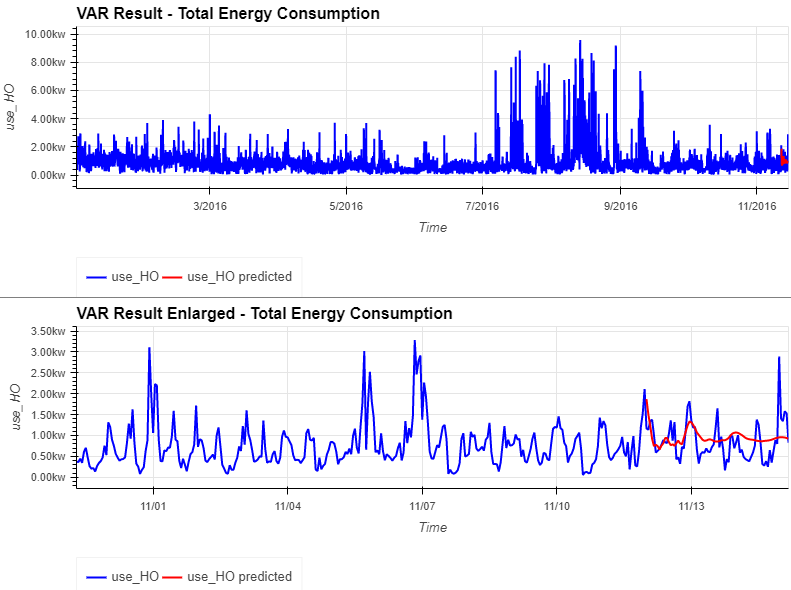
var_wine_mae = mean_absolute_error(var_df['Wine cellar'][-len(varForecast_df):], varForecast_df['Wine cellar'])
((hv.Curve(var_df['Wine cellar'], label='Wine cellar').opts(color='blue')\
  * hv.Curve(varForecast_df['Wine cellar'], label='Wine cellar predicted').opts(color='red', title='VAR Result - Wine Cellar Energy Consumption')).opts(legend_position='bottom') + \
 (hv.Curve(var_df['Wine cellar'][-int(len(var_df)*0.05):], label='Wine Cellar').opts(color='blue') \
  * hv.Curve(varForecast_df['Wine cellar'], label='Wine cellar predicted').opts(color='red', title='VAR Result Enlarged - Wine Cellar Energy Consumption')).opts(legend_position='bottom'))\
    .opts(opts.Curve(xlabel="Time", yformatter='%.2fkw', width=800, height=300, show_grid=True, tools=['hover'])).opts(shared_axes=False).cols(1)
print(model_result)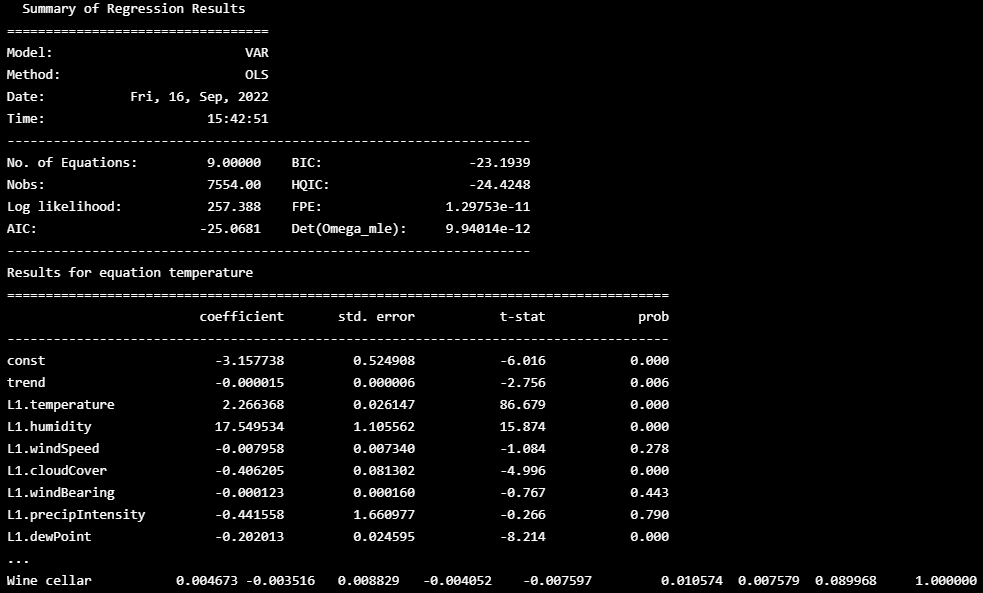
✔ 2) MODEL Prophet
prf_df = df.resample('H').mean()
def prophet_train(train_ratio=0.99, test_ratio=0.01, trg='use_HO', regressors=['temperature', 'humidity']):
#make dataframe for training
tr,te = [int(len(prf_df) * i) for i in [train_ratio, test_ratio]]
train, test = prf_df[0:tr], prf_df[tr:]
prophet_df = pd.DataFrame()
prophet_df["ds"] = train.index
prophet_df['y'] = train[trg].values
#add regressors
for i in regressors:
prophet_df[i] = train[i].values
#train model by Prophet
m = Prophet()
#include additional regressors into the model
for i in regressors:
m.add_regressor(i)
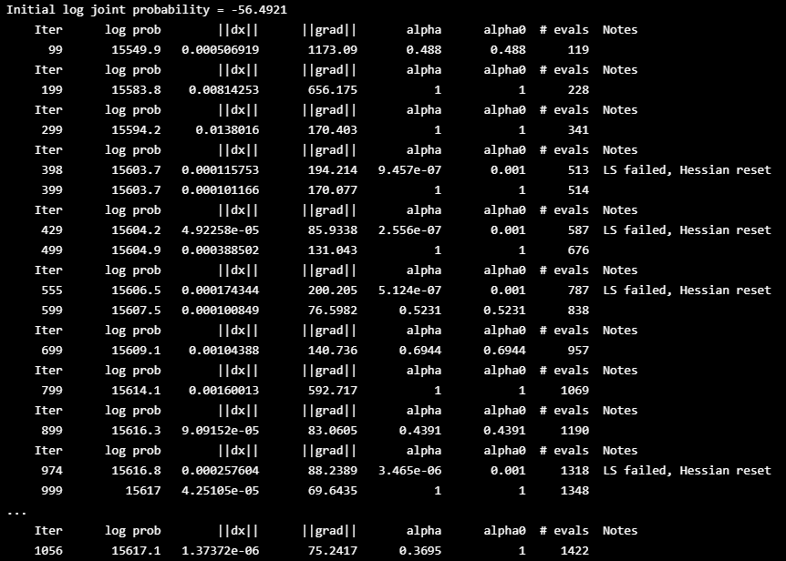
m.fit(prophet_df)
#make dataframe for prediction
future = pd.DataFrame()
future['ds'] = test.index
#add regressors
for i in regressors:
future[i] = test[i].values
#predict the future
prophe_result = m.predict(future)
prfForecast_df = pd.DataFrame()
prfForecast_df[trg] = prophe_result.yhat
prfForecast_df.index = prophe_result.ds
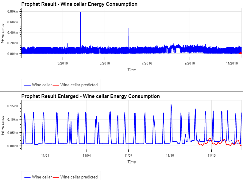
return prfForecast_df- 총 에너지 소비량은 대략적으로 예측할 수 있는 것처럼 보이지만, 와인 저장고의 에너지 소비량은 약간만 예측

prfForecast_df = prophet_train(trg='Wine cellar',regressors=['temperature', 'humidity','windSpeed', 'cloudCover', 'windBearing', 'precipIntensity','dewPoint'])
#evaluation with MAE
prf_wine_mae = mean_absolute_error(prf_df['Wine cellar'][-len(prfForecast_df):], prfForecast_df['Wine cellar'])
((hv.Curve(prf_df['Wine cellar'], label='Wine cellar').opts(color='blue')\
  * hv.Curve(prfForecast_df['Wine cellar'], label='Wine cellar predicted').opts(color='red', title='Prophet Result - Wine cellar Energy Consumption')).opts(legend_position='bottom') + \
 (hv.Curve(prf_df['Wine cellar'][-int(len(var_df)*0.05):], label='Wine cellar').opts(color='blue') \
  * hv.Curve(prfForecast_df['Wine cellar'], label='Wine cellar predicted').opts(color='red', title='Prophet Result Enlarged - Wine cellar Energy Consumption')).opts(legend_position='bottom'))\
    .opts(opts.Curve(xlabel="Time", yformatter='%.2fkw', width=800, height=300, show_grid=True, tools=['hover'])).opts(shared_axes=False).cols(1)
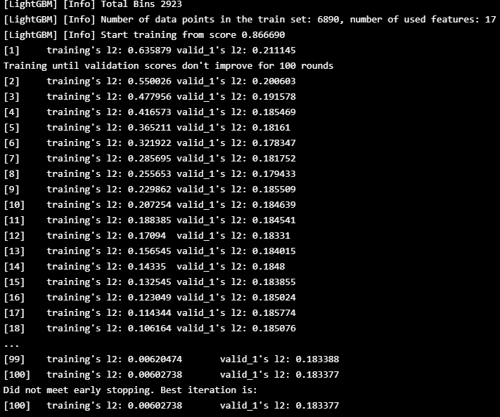
✔ 3) MODEL LightGBM Regressor
- 시계열 회귀 모델을 구축하면 미래의 에너지 소비를 예측하고 에너지 소비와 날씨 정보 사이의 관계를 이해
_lgbm_df = df.resample('H').mean()
_lgbm_df['weekday'] =   LabelEncoder().fit_transform(pd.Series(_lgbm_df.index).apply(lambda x : x.day_name())).astype(np.int8)
_lgbm_df['timing'] = LabelEncoder().fit_transform(_lgbm_df['hour'].apply(hours2timing)).astype(np.int8)
def lgbm_train(cols=['temperature','dewPoint','use_HO'],trg='use_HO',train_ratio=0.8,valid_ratio=0.1,test_ratio=0.1):
#make dataframe for training
lgbm_df = _lgbm_df[cols]
tr,vd,te = [int(len(lgbm_df) * i) for i in [train_ratio, valid_ratio, test_ratio]]
X_train, Y_train = lgbm_df[0:tr].drop([trg], axis=1), lgbm_df[0:tr][trg]
X_valid, Y_valid = lgbm_df[tr:tr+vd].drop([trg], axis=1), lgbm_df[tr:tr+vd][trg]
X_test = lgbm_df[tr+vd:tr+vd+te+2].drop([trg], axis=1)
lgb_train = lgb.Dataset(X_train, Y_train)
lgb_valid = lgb.Dataset(X_valid, Y_valid, reference=lgb_train)
#model training
params = {
'task' : 'train',
'boosting':'gbdt',
'objective' : 'regression',
'metric' : {'mse'},
'num_leaves':200,
'drop_rate':0.05,
'learning_rate':0.1,
'seed':0,
'feature_fraction':1.0,
'bagging_fraction':1.0,
'bagging_freq':0,
'min_child_samples':5
}
gbm = lgb.train(params, lgb_train, num_boost_round=100, valid_sets=[lgb_train, lgb_valid], early_stopping_rounds=100)
#make predict dataframe
pre_df = pd.DataFrame()
pre_df[trg] = gbm.predict(X_test, num_iteration=gbm.best_iteration)
pre_df.index = lgbm_df.index[tr+vd:tr+vd+te+2]
return pre_df, gbm, X_train
🔵 총 에너지 소비량의 예측
lgbmForecast_df, model, x_train = lgbm_train(\
                cols=['temperature', 'humidity', 'visibility', 'apparentTemperature',\
                       'pressure', 'windSpeed', 'cloudCover', 'windBearing', 'precipIntensity',\
                       'dewPoint', 'precipProbability','year', 'month','day', 'weekday', 'weekofyear', \
                        'hour', 'timing','use_HO'],\
                trg='use_HO',train_ratio=0.9,valid_ratio=0.09,test_ratio=0.01)
#calculate SHAP value for model interpretation
explainer = shap.TreeExplainer(model=model,feature_perturbation='tree_path_dependent')
shap_values = explainer.shap_values(X=x_train)- 총 에너지 소비량의 예측은 Prophet model 의 결과보다 더 정확
- Prophet model에 포함되지 않았던 '평일', '타이밍' 등의 시간 정보가 효과적일 수 있음
- SHAP의 특징 분석을 살펴보면, 'week of year', 'timing', 'hour', 'ewPoint', 'thewPoint', 'temperature' 등의 특징의 긍정적인 변화와 'weekday', 'cloudCover' 등의 부정적인 변화가 전체 에너지 소비량의 증가에 영향을 미치는 것으로 생각
- 모델 평가 MAE
#evaluation with MAE
lgbm_use_mae = mean_absolute_error(_lgbm_df['use_HO'][-len(lgbmForecast_df):], lgbmForecast_df['use_HO'])
((hv.Curve(_lgbm_df['use_HO'], label='use_HO').opts(color='blue')\
  * hv.Curve(lgbmForecast_df['use_HO'], label='use_HO predicted').opts(color='red', title='LightGBM Result - Total Energy Consumption')).opts(legend_position='bottom') + \
 (hv.Curve(_lgbm_df['use_HO'][-int(len(_lgbm_df)*0.05):], label='use_HO').opts(color='blue') \
  * hv.Curve(lgbmForecast_df['use_HO'], label='use_HO predicted').opts(color='red', title='LightGBM Result Enlarged - Total Energy Consumption')).opts(legend_position='bottom'))\
    .opts(opts.Curve(xlabel="Time", yformatter='%.2fkw', width=800, height=300, show_grid=True, tools=['hover'])).opts(shared_axes=False).cols(1)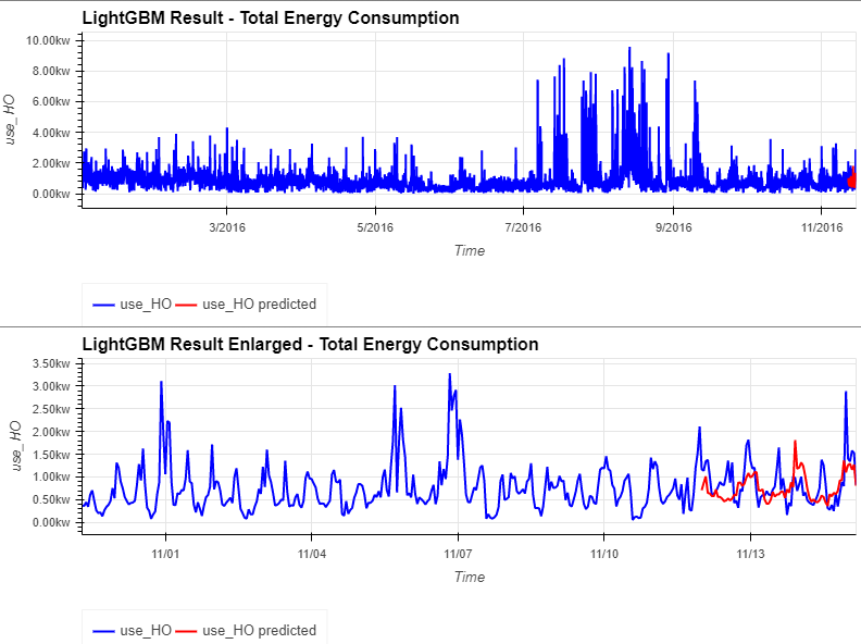
- force_plot
shap.force_plot(base_value=explainer.expected_value, shap_values=shap_values, features=x_train, feature_names=x_train.columns)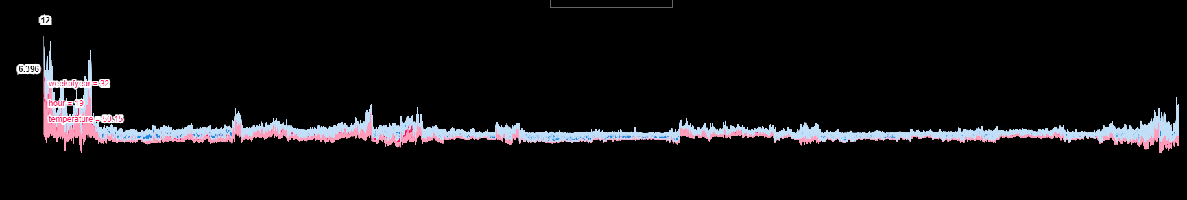
- summary_plot
shap.summary_plot(shap_values=shap_values, features=x_train, feature_names=x_train.columns, plot_type="violin")
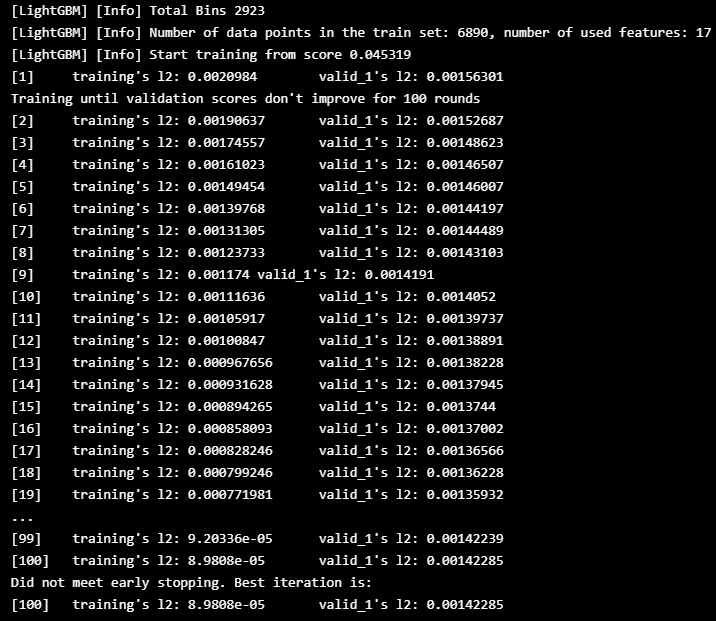
🔵 와인 셀러의 에너지 소비 예측
lgbmForecast_df, model, x_train = lgbm_train(\
                cols=['temperature', 'humidity', 'visibility', 'apparentTemperature',\
                       'pressure', 'windSpeed', 'cloudCover', 'windBearing', 'precipIntensity',\
                       'dewPoint', 'precipProbability','year', 'month','day', 'weekday', 'weekofyear', \
                        'hour', 'timing','Wine cellar'],\
                trg='Wine cellar',train_ratio=0.9,valid_ratio=0.09,test_ratio=0.01)
#calculate SHAP value for model interpretation
explainer = shap.TreeExplainer(model=model,feature_perturbation='tree_path_dependent')
shap_values = explainer.shap_values(X=x_train)- 와인 셀러의 에너지 소비 예측은 Prophet model 의 결과보다 더 정확
- Prophet model 에 포함되지 않았던 'week of year', 'hour' 등의 시간 정보가 효과적일 수 있음
- SHAP의 특징 분석을 살펴보면, 'week of year', 'hour', 'ewPoint', 'wind Speed' 등의 특징의 긍정적인 변화와 '습도', 'cloudCover' 등의 부정적인 변화가 와인셀러의 에너지 소비량 증가에 영향을 미치는 것으로 생각
- 모델 평가 MAE
#evaluation with MAE
lgbm_wine_mae = mean_absolute_error(_lgbm_df['Wine cellar'][-len(lgbmForecast_df):], lgbmForecast_df['Wine cellar'])
((hv.Curve(_lgbm_df['Wine cellar'], label='Wine cellar').opts(color='blue')\
  * hv.Curve(lgbmForecast_df['Wine cellar'], label='Wine cellar predicted').opts(color='red', title='LightGBM Result - Wine cellar Energy Consumption')).opts(legend_position='bottom') + \
 (hv.Curve(_lgbm_df['Wine cellar'][-int(len(_lgbm_df)*0.05):], label='use_HO').opts(color='blue') \
  * hv.Curve(lgbmForecast_df['Wine cellar'], label='Wine cellar predicted').opts(color='red', title='LightGBM Result Enlarged - Wine cellar Energy Consumption')).opts(legend_position='bottom'))\
    .opts(opts.Curve(xlabel="Time", yformatter='%.2fkw', width=800, height=300, show_grid=True, tools=['hover'])).opts(shared_axes=False).cols(1)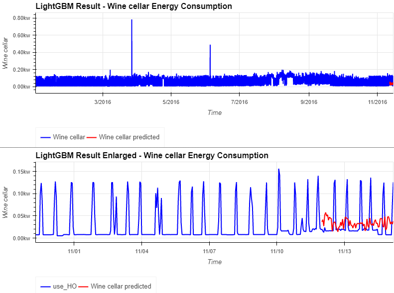
shap.force_plot(base_value=explainer.expected_value, shap_values=shap_values, features=x_train, feature_names=x_train.columns)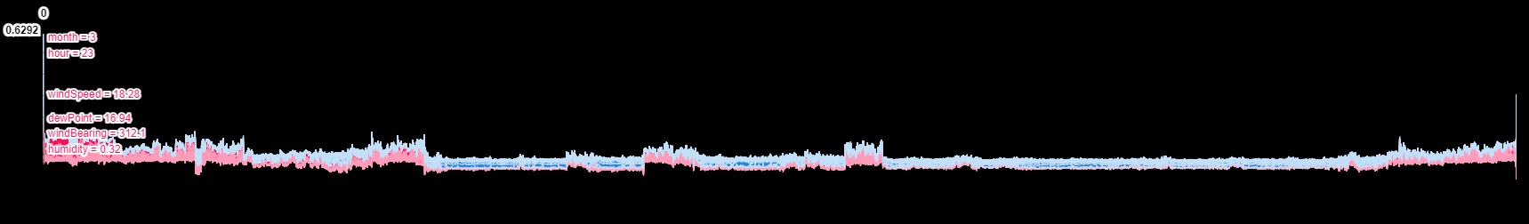
shap.summary_plot(shap_values=shap_values, features=x_train, feature_names=x_train.columns, plot_type="violin")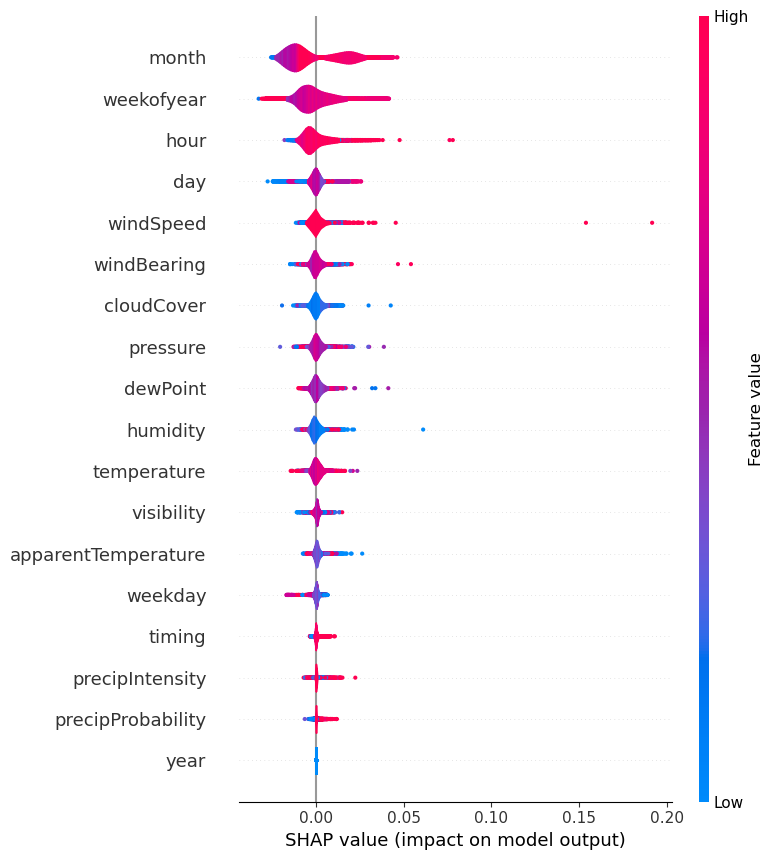
1️⃣2️⃣ Evaluation - MAE
display(HTML('<h3>Evaluation - MAE</h3>'+tabulate([['Total Energy Consumption',var_use_mae,prf_use_mae,lgbm_use_mae],['Wine cellar Energy Consumption',var_wine_mae,prf_wine_mae,lgbm_wine_mae]],\
                      ["Target", "VAR", "Prophet","LightGBM Regressor"], tablefmt="html")))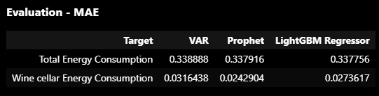
1️⃣3️⃣ Conclusions
- 각 가전제품의 에너지 소비량에는 일정한 경향이 있음
- 우리가 만든 ChangeFinder 모델은 에너지 소비의 트렌드 변화를 조기에 포착함
- President와 LightGBM으로 구축된 모델은 미래의 에너지 소비를 예측할 수 있는 것으로 나타남
- 날씨 정보와 시간 정보가 예측에 매우 유용한 것으로 밝혀짐
'👩💻 인공지능 (ML & DL) > Serial Data' 카테고리의 다른 글
| [논문리뷰] Time Series Forecasting (TSF) Using Various Deep Learning Models (1) | 2022.09.19 |
|---|---|
| 다양한 유형의 Time series forecasting model (시계열 데이터) (1) | 2022.09.19 |
| [Kaggle] Web traffic time series forecast (0) | 2022.09.16 |
| [논문리뷰] Comparison between ARIMA and Deep Learning Modelsfor Temperature Forecasting (1) | 2022.09.15 |
| tsod: Anomaly Detection for time series data (0) | 2022.09.15 |


